RSS 2.0 feed

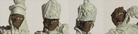
Finished faces, hair and hats.
So, after a brief diversion, it’s back to the painting table to finish off the faces (having done the eyes in the last painting session) and to deal with hair and hats (of various sorts).
The equipment checklist is the same as for the last session with the addition of a size 0 Da Vinci Maestro Series 10 brush. The chart below lists the paints I used in this session:
| Colour | Basecoat | Highlight 1 | Highlight 2 | Highlight 3 |
|---|---|---|---|---|
| Black | Black VMC950 | Dark Grey VMC994 | Neutral Grey VMC992 | Light Grey VMC990 |
| Red | Hull Red VMC985 | Red VMC926 | Carmine Red VMC908 | Orange Red VMC910 |
| Flesh | Burnt Umber VMC941 | Red Leather VMC818 | Flat Flesh VMC955 | Light Flesh VMC928 |
| Iron Grey | Field Blue VMC964 | (Grey Blue VMC943) | Union Blue NAC24 | Azure Grey NAC17 |
| Red Hair | Burnt Umber VMC941 | Cavalry Brown VMC982 | Red Leather VMC818 | Orange Brown VMC981 |
| Dark Blue | Andrea Blue Set 2nd Shadow | Prussian Blue VMC965 | Andrea Blue Set 3rd Light |
In addition to those, I used Burnt Umber VMC941 and Gold VMC996 for yellow metal items; Dark Grey VMC994 and Natural Steel VMC864 for white metal items; and Old Rose VMC944 for lips.
I started with the faces and a first highlight of Red Leather over all but the deepest recesses (like eye sockets, open mouths, under the chins and so on). Remember that we already had a base coat of Burnt Umber on the faces. The next colour is Flat Flesh which again covers most of the Red Leather while trying to leave lines that represent furrows and wrinkles. The final highlight is Light Flesh which should only go on the highest points like the top of the nose, chin, cheekbones and brow. If you overdo this last step you run the risk of making your soldiers look like the undead! The finishing touch for the faces is a narrow line of Old Rose for the lower lip.
Two of the four figures in the set wear covered shakos (and a third carries one). This offers the opportunity for a choice of colours for the shako covers and, if I were doing line infantry or soldiers fighting in the Peninsular, I’d be tempted by canvas/linen shades. However, I’ve stuck to straight dark oilskin covers this time around. Before going for the shako covers themselves, I like to deal with the details on the shakos. Here that means the metal chinscales and the pompoms.
The train soldiers’ lentille pompoms are iron grey, so that’s a simple overall bascoat of Field Blue followed by successive highlights of the other colours listed above. You’ll notice that I’ve put brackets around Grey Blue in the chart. That’s because I didn’t actually use it on these pompoms – partly because I was experimenting and partly because the pompoms are so small that there’s not much benefit to be had from using a fourth colour. The artillery drummer has a nice bright red tufted pompom for which I mostly followed my traditional red palette but using Carmine Red instead of Scarlet for the second highlight. At the moment, I favour this approach because there’s a slightly more obvious difference between the Carmine Red and the Orange Red. For the chinscales, I basecoat in a dark non-metallic shade and then paint the metallic colour over the top. If it needs it, I then use an extremely watered down wash of the non-metallic colour and retouch with the metallic colour for highlights.
Black can be a very difficult colour to highlight effectively. Luckily, these shako covers are a relatively small area, Peter has sculpted plenty of folds into them and they’re the kind of item that I think gets dusty and faded. All that makes highlighting with increasingly lighter shades of grey quite forgiving though the important thing is to avoid making the whole look grey rather than black. To ensure this doesn’t happen, I leave plenty of the black basecoat showing through and, after the final highlight, this is one of the few occasions when I’d recommend some judicious blacklining.
That leaves us with one of my favourite uniform items from the Bardin regulations: the pokelem, which replaced the previously used bonnet de police as the forage cap. Many Marie-Louise’s didn’t receive a proper shako and had to make do with the pokelem instead though I suspect it was a more comfortable item to wear and had the benefit of fold-down flaps to keep the ears warm. The colours I used for the red and blue are listed above. Of note here is that I strongly recommend the 2nd Shadow from the Andrea Blue Set. It gives a dead matt and truly deep dark blue which is an ideal starting point for French blue – more of this in later paint-in sessions. The second point to note is my approach to the piping. I paint the piping first and I don’t worry too much if the lines are too thick or wobbly to begin with as I work up through the successive highlights. Once I’ve done that, I then paint up to the line of piping that I want with the blue basecoat. It’s much easier to get a consistent, neat thin line of piping that way round. Once I’m happy with the piping, I then go on to the highlights for the blue.
While I’m doing the pokalem’s piping, I also tackle the regimental number that typically appeared in red in the middle of the front panel. Let’s face it, it’s too small to attempt to paint actual numbers, so don’t bother! Simply paint a small red patch to give the impression of a number being present.
To finish up, I’ll leave you with a relevant video that Toby Thornton of Artmaster Studio posted recently on YouTube. It’s serendipitously appropriate and well worth watching. The approach to face painting is broadly similar to mine apart from using a slightly different palette of colours and tackling the eyes last rather than first. In the next paint-in session, I’ll turn my attention to trousers and footwear.