 RSS 2.0 feed
There is now a special page dedicated to the BfK Limited Edition Figures project and a link to it has been added to the navigation menu in the header above. This is the place to go for a summary of the genesis, history and progress of the project; the figures themselves and how you can order them from me. Oh yes, it also covers the prize draw and painting guide!
New page for Limited Edition Figures project
Posted by Martin on October 13, 2012
Posted in Announcements, BfK Limited Edition Figures | 1 Comment »
Primer primer
Posted by Martin on May 24, 2014
After a long gap, the bug for creating another video has bitten. Last time (almost two years ago) I did a rudimentary video about Tamiya X21 Flat Base which was quite well received. So here, at last, is my second offering with a look at the Vallejo surface primer that I use nowadays.
Overall, I think this video shows some improvement and evolution over the first but I’ll let you be the judge of that. I’ve got some better technology at my disposal now – it’s amazing what kind of video and sound quality you can get using a just smartphone. Plus I found a nifty little attachment that lets me mount my phone on my camera tripod.
Posted in Paint and Equipment, Tutorials | Tagged: airbrushes, primer, Vallejo, video | 8 Comments »
News trickling out from the Towers
Posted by Martin on May 1, 2014

Calpe Pack P22: march-attack Prussian musketeers.

Calpe Pack P23: march-attack Prussian musketeers, head variants.
After a hiatus almost as long as mine, the 2014 Calpe Towers release juggernaut is ready to roll. Peter F. has had to content with some rubber-related troubles over the last couple of months (sorry, I couldn’t resist that little double entendre opportunity) because his long standing supplier is no more. After trialling a variety of replacements, you can now expect new packs to start becoming available on the website very soon. Are they French, Prussian or Saxon? The answer is: all three!
The immediate focus will be completion of the French march-attack infantry set with packs for voltigeurs and grenadiers with their coats down followed by various command packs. Then there are some Prussian infantry march attack packs and a selection of Saxon infantry packs. Peter’s complete predicted order of priority for work is as follows:
- Finish, the French march-attack set.
- Finish the Prussian march-attack set.
- Finish the Saxon advancing set.
- Finish work on the French gunners.
- Finish work on the Saxon gunners.

Calpe Pack S1: advancing Saxon musketeers with covered shakos.

Calpe Pack S2: advancing Saxon musketeers with calfskin shako covers.

Calpe Pack S3: advancing Saxon musketeers with uncovered shakos.
I think you should see some packs on the website later this week or early next week because Peter has been frantically taking pictures, photoshopping them and writing the blurb to go with the packs. Indeed, some of them already appear to be there! If I’ve got my sums right, there are three Saxon musketeer advancing packs (S1, S2 and S3 – not to be confused with the “old” Saxon packs) and a couple of Prussian musketeer march-attack packs (P22 and P23) already mustered for duty.
Posted in Calpe Towers, Forward Patrol | Tagged: Calpe, France, Prussia, Saxony | 14 Comments »
Feeling bookish?
Posted by Martin on April 29, 2014
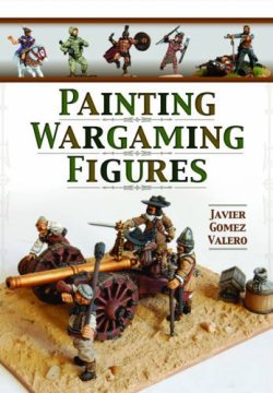
Sneak peek at the cover of Javi Gomez’s forthcoming painting book.
I’d like to draw to your attention to a forthcoming volume from Pen and Sword Books. Javi Gomez, occasionally of this parish, has written a wargames figure painting book which is due for publication (as far as I can tell) in the third quarter of this year. The imaginatively titled Painting Wargaming Figures doesn’t yet show in the publisher’s Coming Soon page but other sources already have cover images and some blurb…
“Javier Gomez, a highly talented figure painter of long experience and excellent reputation, shares the secrets of his success in this accessible ‘how-to’ guide to painting miniatures. He takes the reader step-by-step through the whole process, from choice of materials (unlike other available guides it is not linked to any specific figure manufacturer) and preparation of the miniatures to basing and even advice on photographing the finished item. Techniques such as dry-brushing, ink-washing, shading and highlighting are all explained clearly with the help of step-by-step photographs and colour charts. Specific case studies tackle a variety of useful subjects across all periods, such as mixing realistic flesh tones for different races; painting horses; guns and limbers; Medieval heraldry; Napoleonic uniforms; WW2 and modern camouflage patterns. Javier also clearly explains how these techniques and processes can be applied to all the major wargaming scales, from 40mm down to 6mm. Whatever historical period (or Sci-fi/Fantasy) and whatever scale the reader is interested in, this book is an invaluable source of practical advice and inspiration.”
I’m a big fan of Javi’s painting style and I’m almost certain that this is £16.99 that I’ll be investing wisely. So, Javi, if you happen to read this, can you give us any inside information about the book?
Meanwhile, over at the Osprey Publishing blog, there’s an interesting piece entitled “What subjects should we revisit? We want to hear what you think!” Well, I could hardly resist an invitation like that, could I? It would almost be rude not to add my comments to the 20+ already there. Before you go there or read on here, take a moment to make your guesses about what suggestions I made.
Done? OK…
Award yourself zero points, if you guessed that I made Napoleonic suggestions – come on, even my wife and daughters would have got that much right 🙂 Ditto if you went for Prussians – I happen to think the Ospreys in this area don’t need much updating.
Award yourself one point if you guessed that I went for some Confederation of the Rhine stuff and give yourself a bonus of two more points if you correctly thought of Saxony.
Finally, for the big five point bonus, you will need to have come up with the slightly left-field answer of Italy. I’ve got an old second hand copy of the MAA on Napoleon’s Italian troops first published in the 1970s. While it’s been reprinted in a new livery since then, it’s fundamentally the same book inside the covers as that first edition.
How did you do? What suggestions would you make?
Posted in Forward Patrol, Reading List | Tagged: Javier Gomez, Osprey Publishing, Pen and Sword Books | 7 Comments »
A change of tack
Posted by Martin on April 26, 2014
I have, on occasion, written about how I look at other flavours of the modelling and painting hobby to find ideas and inspiration to bring back to improve my own work. Quite often, it’s involved looking at the activities of large scale (54mm and above) figure painters but every once in a while the idea comes from even further out. In today’s instance, I’ve decided to experiment with something that I found when watching some videos made by a member of the gunpla (or gundam plastic) modelling community. If you haven’t come across it before, gunpla is a niche modelling community that devotes its energies to kits depicting the mechas, vehicles and characters of the fictional Gundam universe by Bandai. It’s extremely popular in Japan and South East Asia but has spread to Europe and North America. Which is handy for me because the videos I’ve been watching have English narrations!
So what’s it all about? If you were paying attention at the end of my last posting, I mentioned that I’ve been getting to grips with my (now not so) new airbrush. Without getting ahead of myself, one of the most productive uses I’ve found for the airbrush is priming figures. But I’ve run into a slightly messy problem with the way I mount figures for painting. Until now, I’ve favoured blutacking the figures to plastic bottle tops and this has had many advantages – it’s cheap (we have lots of spare bottle tops passing through our house), it’s easy and the grips on the bottle tops are a neat aid to twisting and turning the figures when I’m painting.
But when I’m handling figures mounted that way and using an airbrush instead of a conventional paint brush, can you guess what happens? Yep, I’ve been getting a lot of primer on my pinkies. Sure, I could buy disposable plastic gloves but that’s another expense and I suspect it would actually be pretty fiddly when it comes to removing the gloves. And that’s where this video came to the rescue. I love how people are creative with re-purposing common objects for something different. In this case, look what you can do with some crocodile clips, a few wooden BBQ skewers and a bit of of polystyrene packaging.
Since seeing this video, of course, I’ve come across this idea being used already all over the place, particularly by aircraft and military vehicle modellers. So you probably knew about it before me. Still, you’ll be seeing plenty more of those crocodile clips on sticks from me in future – so you’d better start getting used to them.
The fringe benefit of this way of holding figures is that is avoids a seasonal problem I’ve observed with the blutack method. During warm Summer days, I’ve noticed that the Blutack softens and, mainly on heavier figures like horses, its grip on keeping the figure securely attached to the bottle top becomes tenuous. I’ve had a few pieces gradually keel to one side in slow motion necessitating a pause in painting to firmly reposition the wayward figure.
There is one footnote to this idea. While we all have easy access to polystyrene packaging and BBQ sticks are sold in almost every supermarket as soon as the Summer arrives, getting hold of crocodile clips takes a bit more effort. Especially if you want to get a lot of them at a reasonable price. Frankly I was shocked a the prices charged by some big name high street retailers – and the meagre quantities in the packs. Those of you in the United Kingdom may be amazed to learn that Halfords charge £1.69 for a pack of two and Maplins charge £1.59 each! Prices correct at the time of writing, as they say. Alright, both come with plastic sleeves but I don’t need those. So instead, I turned to searching Amazon and eBay and was quickly able to source a pack of 20 for the princely sum of £6. A unit price of only 30p.
Posted in Paint and Equipment | Tagged: bottle tops, crocodile clips, gunpla | 8 Comments »
